Calling
A user says "call Stephanie", there are two Stephanies across WhatsApp, Messenger, and native phone. This is the problem I solved across 5 devices for 3 years.
Owned the Calling domain across 5 Meta devices for 3 years, leading the transition from a rules based system to a model based architecture that reduced task failures by 55% and became the foundational interaction pattern for Calling, Messaging and Sharing across the wearable ecosystem.
I was brought in to own this domain at the moment it needed to transition from rules-based to model-based, a shift that required someone who could bridge conversation design and machine learning.
Aligned Calling, Messaging and Sharing owners around model based dialog as the shared interaction pattern.
Onboarded and trained every new designer on model based dialog, having built the system from scratch.
Mentored junior designers during team expansion on Portal, growing the team's domain expertise.
Worked closely with research, engineering, annotators and PMs. Authored annotation guidelines for model training and evaluation.
As a native Spanish speaker, I designed all calling interactions in both English and Spanish. A key launch was WhatsApp calling in Spanish on Portal, critical during the pandemic when 46% of U.S. Latino adults used WhatsApp (double the general population) to stay connected with family.
Principles
Speed
Prioritize quick and efficient communication by minimizing the time and steps required to initiate, answer and end calls.
Seamlessness
Strive for a seamless integration across smart glasses and smart phones creating a unified experience.
Integration
Connect through our different family of apps as providers respecting a cohesive experience for smart glasses.
Confidence
Design with elements that instill confidence to our users on the UI and Voice, fostering trust in the calling experience.
Intuitiveness
Ensure a clear and concise interface that allows users to easily navigate and initiate calls without confusion.
Key trade-offs
Speed vs. Accuracy
Choosing between fast, implicit resolution vs. explicit user confirmation. Faster flows reduce friction, but explicit confirmation reduces errors in high stakes actions.
Simplicity vs. Density
Designing for an ultra constrained heads up display required prioritizing simplicity over detailed information to avoid cognitive load.
Voice vs. Multimodal
Determining when voice should lead vs. when to offload to visuals or gestures. Voice is natural for intent, but inefficient for selection or repeated actions.
Model Based Dialog for Calling
Users don't follow scripts. They interrupt, change their mind, use nicknames, say "call my mom" instead of a contact name. Rules-based systems break on all of this. Model-based dialog replaces rigid decision trees with a system that interprets intent, resolves ambiguity, and recovers from misunderstandings.
What I did
Replaced deterministic flows with a model that interprets conversational signals and adapts to how people actually speak.
Instead of ending interactions on errors, designed context-aware strategies that recover and keep the conversation going.
Established the end-to-end pipeline for annotation, training, and evaluation of the dialog model.
What began as an experiment on Portal became the shared pattern for Calling, Messaging, and Sharing across all devices.
Each device pushed the interaction model further: from a screen with voice, to voice with no screen, to voice with a heads-up display.
Meta Portal
Portal was the first device where we applied model based dialog to calling. We were figuring out what worked. The device became a hit during the pandemic as people relied on it for family connection when in-person wasn't possible. A key challenge was multi-generational users: senior users were power users who relied entirely on voice since traditional tech interfaces weren't intuitive for them.
Seniors were using video chat weekly by 2020. 70% had used it at least once during the pandemic.
Source, AARP"Regular video interactions can reduce depression symptoms in older adults by up to 50%."UCHealth
Designed voice + visual calling flows using Model Based Dialog, focused on making interactions simple enough for non-tech-savvy users while keeping the visual UI clear and accessible on the large display.
Portal was a home device, which meant users were often not standing next to it. They could be cooking, walking around the house, or in another room. The voice assistant had to be fast and accurate enough to place a call or guide users through calling features from across the room, without needing to touch the screen.
In-Call Capture
Let users capture photos during calls with a hand wave or by asking the assistant. The voice experience was critical here because it happened mid-call. The interaction had to capture the moment without interrupting the conversation. Users could review photos later on the phone, turning video calls into something more than just communication.
Ray-Ban Meta
No UI at all. Everything was voice first. Calling has a unique speed urgency where users don't want multi turn conversations with the assistant. It had to be fast and accurate because there's no visual confirmation. Multiple providers (WhatsApp, Messenger, native phone, Instagram Direct) made accuracy critical. You don't want to accidentally call a Facebook connection from 10 years ago.
Redefined user flows as sample dialogues that served as both design artifacts and training signals. The model attempts recovery for up to 2 turns before gracefully ending, prioritizing disambiguation accuracy across all providers.
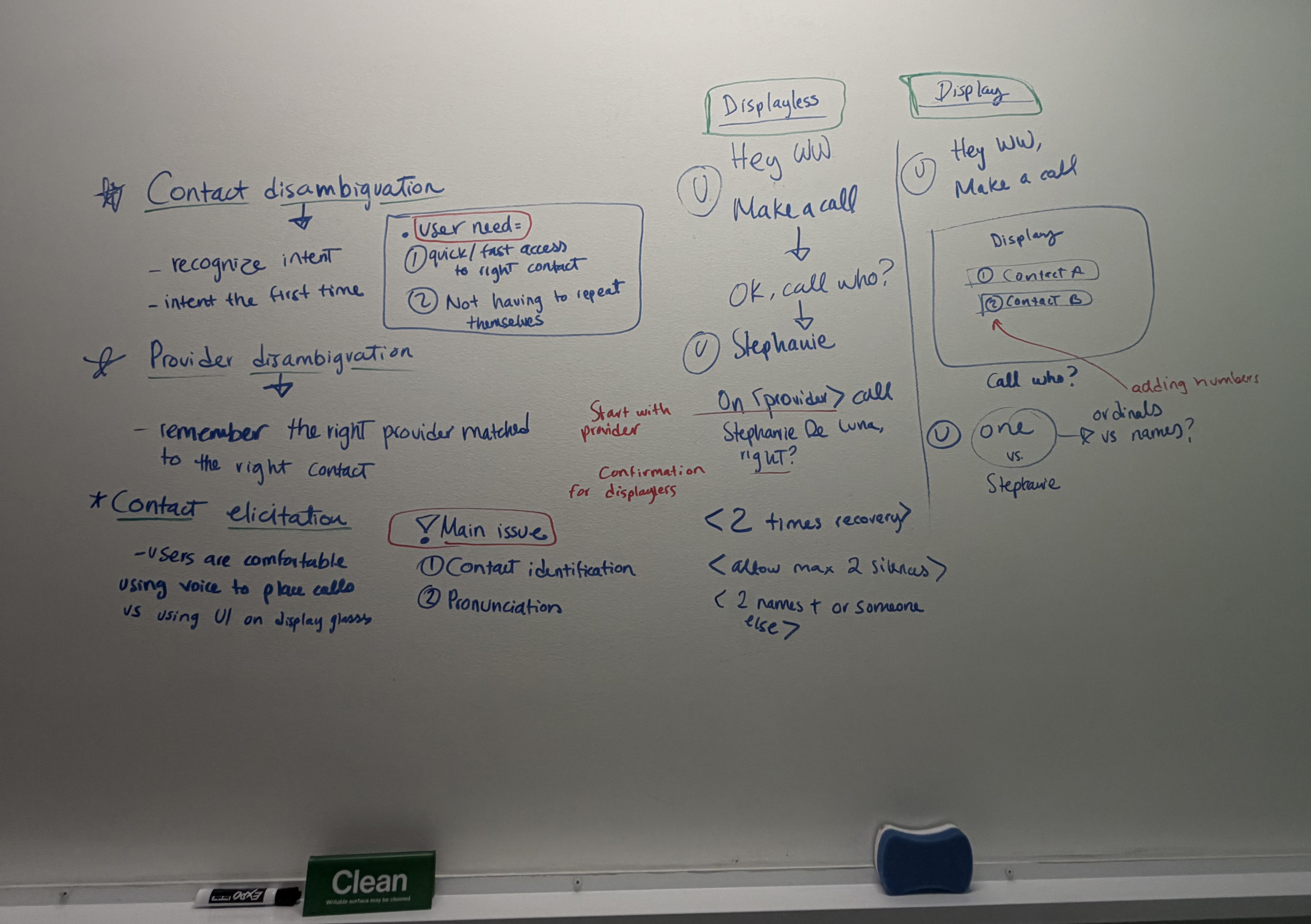
Ray-Ban Meta Display
An entirely new form factor with no existing prototypes. A very small screen in the user's eyeball meant choosing wisely when to use visuals vs voice. We also introduced earcons as audio signals and had to manage cognitive load carefully. People already know calling from their phone, so the challenge was making it feel familiar while bringing a wow factor.
Heavy reliance on prototyping to feel out interactions before the hardware existed. Carefully selected when to use the display vs voice vs earcons. Designed for three input methods (voice, gestures, display) working together without overwhelming the user.
AI has become a core part of my design process. I use Claude to rapidly prototype interactions and test ideas before investing time in high fidelity mockups. This lets me explore multiple directions in hours instead of days.
The prototype below was built entirely with Claude. I described the calling flow, the disambiguation logic, and the visual language I wanted, and iterated on it through conversation. This approach lets me validate interaction patterns, test edge cases, and communicate design intent to engineers and PMs with a working artifact rather than a static spec.
Start by describing the flow, edge cases, and modality decisions in natural language.
Refine the prototype by asking for changes, testing different states, and adding detail incrementally.
The result is interactive, not a static mockup. Stakeholders can experience the flow, not just read about it.

This prototype was built with Claude and is for exploration purposes only. It does not use the official design system.
Initiated a cross-domain effort to reduce TTS length across wearables. Collaborated with Messaging and Sharing designers to shorten prompts across all three domains, resulting in a 40% reduction in TTS errors.
Collaborated with the sound design team to create earcons for each calling state and provider. Designed the assistant listening state earcon, a cross-functional effort that became consistent across all voice interactions.
Over 3 years, I shaped calling from a rules-based system into a model-based architecture that became the foundational interaction pattern across Meta's wearable ecosystem.
The model-based dialog system I designed for Calling was adopted by Messaging and Sharing, becoming the shared interaction pattern across the Comms domain. The cross-domain TTS shortening initiative and earcon design work further standardized voice interactions across the wearable ecosystem.
Writing annotation guidelines for model training taught me that the boundary between design and ML is itself a design surface. The guidelines I authored directly shaped model behavior, which means conversation design at this level is as much about training data as it is about user flows.
Designing for seniors on Portal gave me a perspective I carry into every project: if the interaction works for someone who has never used a smartphone, it works for everyone. That constraint made the voice experience stronger for all users, not just the target audience.